Booking.com Design Language
How we speak travel
Product experimentation and a decentralized organization were fundamental to Booking.com’s success since its founding in 1996, but over time the brand and user experience became disjointed. Rising competition and heightened customer expectations demanded a more unified approach. Our solution was to create Booking.com’s first Design Language.
Role: Principal Designer
Responsibilities: design, art direction, creative direction, team recruitment, stakeholder management, naysayer conversion and general cheerleading
Working alongside another principal designer and backed by our craft leadership, we recruited a small team of designers and writers to bring the design language to life. Our research started with the brand team to better understand our newly-minted brand promise, Make it easier for everyone to experience the world, as well as the strategy moving forward.
We audited all Booking.com customer experiences, inclusive of the traveler and the business partners. However, the hundreds of screenshots and strategy docs only told part of the story. To round out our knowledge we hosted a series of workshops with the UX and creative communities, uncovering nuances in the customer experience, as well as organizational silos and inconsistencies.
Through this process we learned that our small team, in all likelihood, couldn’t account for every UX scenario facing Booking.com. Our solution was to democratize the Design Language by providing objective definitions (eg. these are what our colors are) alongside philosophical guidance (eg. this is why this photo is on-brand). The built-in flexibility was intended to give teams across the company the agency to make the best decisions they could, while still providing a more consistent brand and user experience.
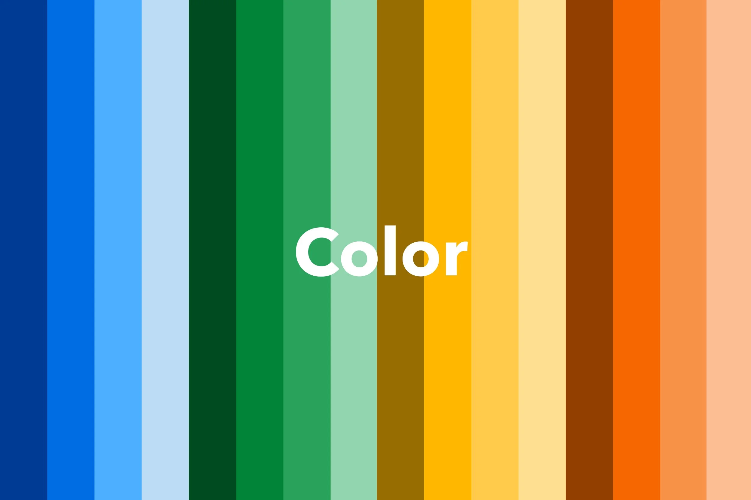
The Design Language was made up of six ingredients: Color, Typography, Layout, Iconography, Voice and Tone, and Photography. I was involved in the creation of each of these ingredients end-to-end, providing feedback, creative direction and stakeholder management.
I specifically authored the Photography documentation, establishing standards for style, quality, application and brand alignment.
Once the ingredients were defined we hosted a series of feedback sessions and workshops, illustrating specific parts of the customer experience to the specific teams entrusted with implementation. This vital step identified opportunities for improvement, while also giving teams a chance to onboard with the Design Language.
Despite the numerous organizational complexities and a global pandemic, we were able to complete the project in less than a year. We published the Design Language in late 2020, alongside new Booking.com brand standards — both of which saw immediate adoption.
The following year we added Illustration as a seventh ingredient and developed a custom font to enhance the design’s consistency. Now, a dedicated team maintains this mission, building on more holistic documentation and automated adoption tools for a consistent Booking.com experience.
🙌
Special thanks goes out to the talented Design Language Team, from whom I learned so much about the craft, Booking.com, and how to survive a global pandemic.


